Up to 30% of Apple Vision Pro Returns Are Because Users Don’t Get It, Analyst Says::While Vision Pro returns were uncommon, many came down to owners not figuring out its spatial computing.
1% of the headsets are returned. 30% of those returns (0.3% of the overall headsets) are because the user couldn’t figure it out.
This is clickbait.
To save me reading what is surely a terrible article, what aren’t people getting?
Wow, from all the stories of people returning them for all kinds of reasons, I thought the number of returns was way higher.
That’s actually a decent piece of information for the article to include IMO.Removed by mod
I didn’t even have to spend $3,500 to not get it!
Why are devices like this called “Pro”? Are there people making their living as goggle-laden douche nozzles?
‘Pro’ just means you can charge more.
It stands for ‘Profits’
There is regular and then this is Pro model. Obviously a cheaper VisionPro is coming in the future.
(Setting aside how much I hate Apple for the moment)
A lot of these VR and mixed reality things are much neater in theory than in practice. I have tried the whole virtual-desktop-in-VR thing before and it just isn’t really much more productive unless maybe you are really pressed for space. You can just get another monitor, not have to wear a giant gizmo on your head and be able to drink your coffee while you work without issue.
Makes sense to me. Sounds weird but some people don’t have the ability to think in 3D. My wife is one such person. For example she can’t combine in her head her actual spatial position and surroundings with Google Maps, so she can’t use it. Same with those 3D rotation IQ test types of puzzles. I’m sure she wouldn’t be able to use spatial computing.
Yeah this isn’t surprising news to me. I can see the vision being super useful in some niche business/art cases but for 99.9% of people it’s a prohibitively expensive toy.
And what about the broken glass?
I mean this is just like with all VR headsets. Most people simply dont need to have a screen strapped to their face, let alone at the cost of 3,000 buckaroos
I see iPhones as hand holders so makes sense older parents bought them and introduced their kids to them. Which again, are being held by the hand on what they can use and not use.
They can’t figure out new technology. I’m able to use an iPhone even though I’ve never had one but opposite can’t be said about people using my android. It’s weird.
If the user can’t figure it out you built it wrong
Not defending Apple here necessarily but have you not ever been in line for a self checkout? It’s not a difficult piece of software or equipment to use and in my experience half of the users if not more cannot handle it. Users are really fucking dense
Self checkouts don’t work the same across stores, don’t accept the same methods of payment across stores, require human intervention the moment anything off the happy path occurs (like not moving an item fast enough and it scans twice), provide constant interruptions during the execution of their single purpose, and are unfathomably slow and inconsistent at what they do.
They just don’t work well.
The only intervention I have ever needed over 20+ years of using was for an ID check, it’s very very possible to use them without having an issue 99% of the time. They fuck up because people don’t have any patience or just a general misunderstanding of how a cash register works, which is not a difficult concept
They also fuck up because they aren’t designed and implemented properly.
- Walmart’s don’t accept tap to pay.
- Whole foods’ requires manual keying in of pastry items as different options (they don’t have danishes in their DB so they need to be rung up as a bagel; per the human worker that resolved the issue for me when I predictably couldn’t find the item they failed to include).
- None of them allow you to cancel the order (such as when you want to check the price of an item because the store neglected to actually list the price on the floor).
- None of them let you remove an item (such as a duplicate scan or removing a luxury item that stretches your budget or rang up higher than you were expecting).
- You can’t purchase shaving goods, alcohol, canned air, or other adult items without intervention (probably no way to actually avoid this one, but it doesn’t promote a smooth flow) and the kiosk often locks down until aided by an associate preventing you from continuing to scan your items while you wait.
- Often locks the kiosk when placing a reusable bag in the bagging area.
- Inconsistent payment methods: some allow you to scan your card at any point in the process, some process payment the moment your card is scanned, some require a manual trigger on screen prior to scanning your card.
- Often forces popups between scans (“This kiosk is in card only mode,” “Enter your loyalty card number,” or “how many bags did you use today?”)
I’d like to:
- Walk up and set down my bag
- Scan all my items
- Remove arbitrary items
- Tap my card
- If required; verify my age and have an associate clear any blocks
- Grab my stuff and leave
Instead what often happens:
- Walk up and set down my bag
- Kiosk locks because there’s an item in the bagging area
- Pickup my bag, move to a different kiosk and set my bag on the floor
- Scan my first item
- Dismiss the card only pop-up
- Dismiss the loyalty pop-up
- Scan the item again because the first scan just wakes the machine and the order doesn’t start until you dismiss 2 popups
- Put the item in my bag on the floor
- Scan the next item
- Dismiss pop-up about first item not being in the bagging area
- Take first item from my bag on the floor and set it in the bagging area
- Kiosk locks until associate clears it
- Scan a razor blade
- Kiosk locks until associate clears it
- Scan the remainder of my items
- One of them scanned twice
- Click the visible delete button next to duplicate item
- Kiosk locks until associate clears it
- Tap my card
- Realize that this unit works differently than the last one I used and click the “Finish and pay” button
- Select card as the payment type (on the kiosk in the card only queue getting run in card only mode)
- Dismiss the bags used pop-up
- Tap my card again
- Move all my items from the bagging area to the reusable bag on the floor
- Collect my receipt and goods and leave
I’m glad that you’ve consistently had a good experience with them, but I have not. While each of our experiences are anecdotal, the machines’ failure to routinely accommodate my expected use case is an engineering failure. I am a software engineer by trade and know how to interact with computers well. While we have a running joke about customers not reading what’s on their screen that’s no excuse to design an interface that cannot properly react to unexpected or unusual inputs or tasks.
I’m not gonna sit here and tell you your experience is invalid, but having watched thousands of people interact with self checkouts I have to say yours is an outlier at least to my experience, I just see people who expect the computer running the software to read their minds. Never once have I seen a system just do something and lock up without improper input, I’m sure you’re a very bright and tech savvy person but that doesn’t preclude you from having blind spots in the POS sector which is very different than most others in tech. Scales can fall out of calibration but that is really easily fixed by a program within the systems, it would literally take ten seconds if the retailer gave a damn
Can’t help you with the Walmart tap pay though, that’s on them as a retailer and one of the many reasons I don’t shop there, although I know that’s not an option for everyone.
You know, I have to agree with unmagical on this one. It’s gotten to the point where if I want to just run into the shop for a quick trip there’s a mental list of things to avoid that will cause trouble. I’m of the opinion that if I have to change my behavior to avoid something putting up artificial roadblocks for me, then that system is a failure. Case in point I went to CVS to buy some cough medicine for my kid the other day and discovered that cough medicine is now age-restricted. Instead of letting me scan my driver license (you know cause the kiosk has a bar code scanner and my license has this fancy new bar code) the clerk has to come out of whatever dungeon he was in to put the mk 1 eyeball on me and give the kiosk his blessing.
The self checkouts where I am get confused from things as simple as a customer placing their own bags on the scale before even scanning anything and constantly need staff intervention. Not to mention how often prices are wrong on these systems. For the cost of constantly developing, upgrading and maintaining them. In the long run companies would be better off training a few extra staff for express lanes instead. Only my humble opinion though.
Why would you place your bags on a scale designed to detect a scanned product, scan everything pay and then bag if you are bringing your own. That’s what I do every time, stop thinking it’s anything more than a customer facing cash register, the scale/bagging area is the area of transition between pre and post purchase, once the transaction is done it stops caring. I don’t understand how someone can make more than one mistake on those machines without learning what not to do
Because that’s double handling and the scales where I shop have bag holders on the side of the scales for their own bags, hence they are designed to account for the bags weight before scanning and placing items.
Not to mention that some of these systems are really badly made.
Self checkout is a corporate excuse to not train employees and instead get customers to work for free performing point of sale. Expecting customers to be trustworthy and care about performing this task competently for free is “fucking dense”.
That’s what it’s become, but it’s also an easy way to get in and out without talking to anyone if you aren’t dumb as shit. If understanding how a cash register works is so hard we should be paying the workers who do so much better and giving them much more respect. We really should anyways but that’s a different issue.
Corporate initiatives to reduce workforce by misusing technology isn’t the fault of the tech itself. Which is incredibly easy to use, or at least I haven’t ever had an issue that wasn’t the result of another customer over the entire time self checkouts have existed
Edit: to be clear I’ve watched people struggle with them long before giant retailers decided to get rid of as many human cashiers as they can, that is fucked up and I hate that as much as y’all do, but that isn’t the fault of the self checkout system that was originally supposed to alleviate traffic by allowing those only buying a few items to bypass the lines
Self checkouts are the worst! Perfect example of bad engineering. I had the shower thought the other day that perhaps they design them to be slow and crappy so they can gather more biometric and video data of us at the checkout 🤔
Seriously though there is a whole branch of hardware engineering that specialises in making things intuitive and user friendly…even for the special needs (apple customers)
It’s less being bad engineering and more capitalists not wanting to devote enough money to fix a problem.
If you have a problem with working self checkouts that isn’t related to a scale calibration that’s on you, I’ve been using them without issue since I was a teenager which was two decades ago. They are stupidly intuitive
The scales are always off and unnecessary anyway. They factor shrinkage into the price.
That’s only true if you assume that people are generally smart, especially when it comes to technology. Such an assumption seems to me to be… overly generous.
Factoring in intuitive functions is part of proper engineering
Nah GUIs were a mistake
I mean, Apple is THE accessible usage company of the world. If you think that Apple can’t make it work, then you also think that nobody can make it work.
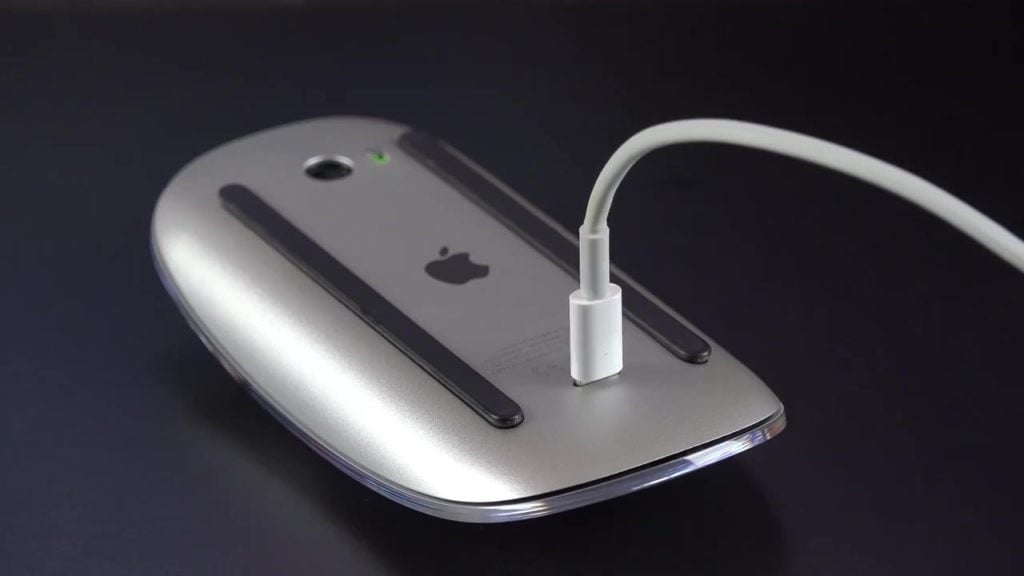
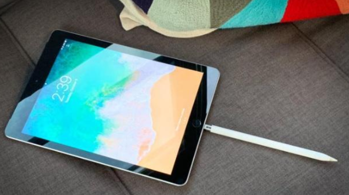
Counterpoint:


Made me chuckle … mfers stopped being UX friendly and accessible a long time ago. I still want the home button on iPhones back, it was the perfect phone for my granny but I upgraded her to an XR and she did not get it, gave her an android instead . the button made it way more usable
Your grandpa can plug that in. That’s what makes it accessible. If you don’t like their design choices, that’s a different question.
Plug it in and use it you say?


