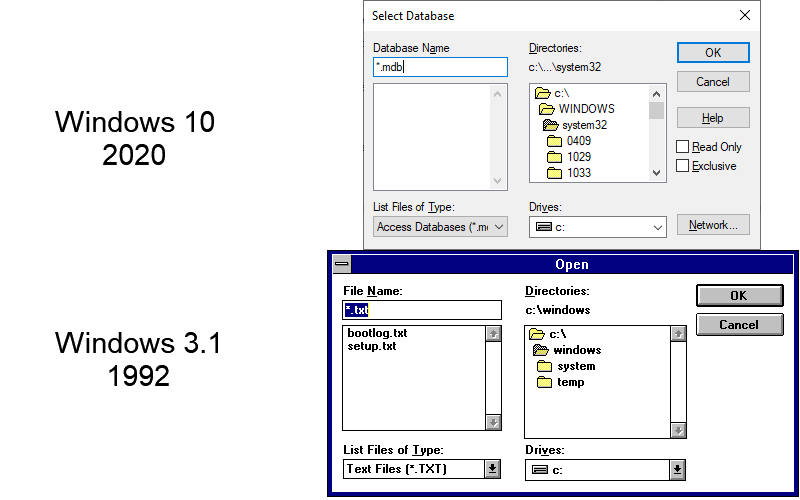
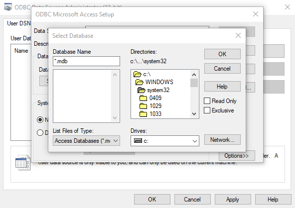
I don’t know why I even bother opening the settings app
You go deep enough and very Windows 95 looking menus pop up. Like are they building over the old system? It’s all very strange.
yes they are, actually. Backwards compatibility is a huge thing in Windows, it’s why you can’t name files certain names such as CON, and why you can find things from 3.1 etc. still.
That’s what happens when your entire business model is promising to support [your business name here]'s favorite feature forever. It makes a lot of money, but boy does it make for a terrible product
There’s some even older UI bits buried around in there:

At some point last year I had a Japanese program launch a popup window that was clearly from pre-NT Windows. So bizarre.
I’ll have you know windows has changed.
Now you can’t move the task bar
Only 23 years?
I don’t think this bad lad has changed since Windows 3.1

3.11 but yeah
It’s like Windows is devolving into really, REALLY early Linux, where a single Control Panel application is broken up into a half dozen separate parts and scattered throughout the interface in a dozen separate sub-sub-sub menus.
You should NOT have to hunt for the “print” button in a freaking word processor.
Ctrl + p still works?
Because Microsoft went full Apple and adopted the “we know what’s good for you so don’t defy our decisions” philosophy of UX design.
The difference is that Apple usually executes it well, and Microsoft doesn’t.
You set a Windows PC to dark mode, half of the system is still bright white. Apple wouldn’t dream of doing that shit.
You start searching in the start menu, it’s slow, gives you different results each day, misses a bunch of stuff, and tries to send you to Bing. Apple wouldn’t dream of doing that shit.
Microsoft comes up with a new UX, but it’s only a thin veneer, most of the system doesn’t even use it and instead uses Win7 or earlier menus. Apple wouldn’t dream of doing that shit.
For all their flaws (and believe me I know they have many. I don’t intend to ever own an Apple product), Apple actually gives a shit about having a polished and consistent UX.
They wouldn’t have a dark mode that still leaves half the system white, they wouldn’t have 20+ year old UI cruft, etc.
The issue is that Apple had that mentality from the start. Microsoft tried to Frankenstein it in after the OS had already matured under a different UX philosophy, not only that, they also didn’t commit all the way to changing the philosophy since they still wanted legacy support. They basically ended up with the drawbacks of both philosophies and very little of the benefits of either.
It’s not that because Microsoft is changing their own UI. IMO this is the typical corporate climber problem all corporations have. No one gets promotions maintaining software. So you get designers changing stuff for the sake of change so it can go on their resume.
They went full WEF
I am really going to miss the old settings when they finally remove what is left of Control Panel. So far they have removed things or moved shit to force the Settings app. But they keep failing to make the new things have anywhere near the level of control. The power settings from Control Panel still matter way more than Settings and seem to actually stick when applied. And I just really have no idea how they have made stuff like resetting networking/connection issues worse over time. Fucking right-clicking on the networking icon on the taskbar and picking “repair” would actually get shit working again 8 times out of 10. But just seems to be a placebo at this point. There are still so many times that using different resets in Internet Options fixes more stuff I see regularly than the resets in Settings->Networking.
And the newer Troubleshooting options never fix any of the Windows Update issues I come across. Just a glorified verification of the failures I already know are happening. I never thought I would so badly miss being able to tell Windows Update to ignore updates if they were bugging out (not to avoid them all together but at least stop the OS from just constantly going through the motions of installing and failing during each reboot/shutdown). So many of the updates that used to give me issues were really either down to them trying to install out of order or due to a fuck-up on MS’s end that pushed bad updates.
The push to so deeply embed these AI models into everything so fast is really pissing me off. Shit is known to have issues with just outright making shit up. Which is IMO reason enough to not be adding them to end-products (especially since the end-products are also still not finished with removing old versions of things). One thing that really worries me in my job with fixing people’s PCs is the AI and search that pushes web content (and the now inescapable placement of ads) above local resources/programs/settings/etc. The main issues people have aren’t actual viruses like in the past. It is the massive levels of scams and fake alerts followed by fake “repair techs.” If the average person is so easy to trick when it is people scamming them. AI is going to blow shit up waaaaaaaay worse and will be able to do it so much faster and completely. Average people are still under the impression that these AI chats are giving completely real and accurate information (reminds me of how people used to believe that if something was said on TV that it was real).
Shit is fucked and going to get much worse at a dramatically faster rate due to rushing things in order to make as much money as fast as possible. Even Microsoft used to ship things in a more complete state. But gaming has made shipping broken products completely normal. So no reason to care about keeping any level of quality.
I was honestly excited about the new Settings when Windows 10 arrived. I was a Windows sysadmin for more than a decade and am intimately familiar with control panel and think it sucks. I hoped Settings would modernize and streamline. But here we are, so many years later, and many common tasks still lead us to control panel. Such disappointment.
21st century Windows developer: “Hey! You know what people REALLY want in a text-based Office Suite? VERY very light gray text on a white background!”
On the other hand, it should be 7% black (gray) background for 100% black text, and inverse for dark mode.
Really annoying start search that doesn’t go to the control panel programs but opens bing search instead, also the right control panel features are not linked from the new 2024 system app ui WTF
The new windows appification and UI shit screams “we think people are straight up fuckin retarded” to me. They might as well manufacture keyboards to look like speak and spell toys
If it actually was easier, I wouldn’t complain. But in most cases, the new settings make it harder to find and change settings.
According to Dave Plummer, a retired Windows Engineer, there are actually bugs in some of the windows components because he intended for them to be temporary solutions, like the CPU or Hard Drive usage numbers had to be Massaged to be lower than 100%, for example. When the Task Manager doesn’t respond you can actually use Ctrl+Shift+Esc to queue up a new Task Manager if the old one doesn’t revive itself. That stuff hasn’t changed since 1996.
He also wrote the File Formatter, which has a file size limit of 32Gb for the Fat32 format for the same reason: it wasn’t supposed to be permanent, but it hasn’t changed for over 20 years. The concept at the time was that Cluster Slack would make a large drives like a terabyte more than 99% wasted space in the format, so 32Gb was arbitrarily chosen as a limit.
fyi Dave was involved in some scareware bullshit as one of the main actors and sued for it. Fuck this guy.
Very unfortunate to hear. I wonder how much of his YT Channel were lies?
I aggree. I really liked his videos until came across this info (back then on reddit).
I wish home and pro version influenced the setting panes. I get what they’re trying to do with making it look like OSX and Linux and why the “network interface and adapters” probably isn’t helpful for many home users, but I just wanna manage my interfaces here.
As I’ve heard this explained, enterprise admins have scripts, and to a less important extent muscle memory, tied to Control Panel layout and command lines, and that’s not a group you want to irritate.
Hey, at least Windows has really good backwards compatibility.
That is only maintained due to the new operating system being a new shell placed on top of the countless older shells and some new small features that rely on the newest most fragile thing they added with the shell
I heard some call it the “painting over rust” method, and they’re maintaining the most used and by some organisations the most relied on operating system in the world
So fucking annoyed at the taskbar overflow shit in Windows now. I don’t want it hiding any of my system tray icons…I want to see what’s running and I don’t care how it looks. Every time certain apps update themselves, I have to go in again and select that particular app to hide itself with no way to tell Windows to just stop trying to hide system tray icons altogether. I’ve told it to hide Discord and the Xbox app probably 20 times each now and it conveniently forgets my decision every app update.
I’ve got fed up of them changing how many hoops you go through to get to the old settings so I have the .cpl commands memorized that work no matter what computer you’re at
Appwiz.cpl ncpa.cpl for common examples


