Well, it would be
- more confusing if they shaped it like an iPhone,
- more unstable if they shaped it like the magic mouse with the power port at the bottom,
- super cute if they kept the exact mac pro tower design but super smol,
- actually useful as a vase of they used that cylinder mac pro design from 10 years ago
That cilinder Mac Pro was a fever dream but I still love the design
Smol Mac Pro would have been the best possible reality here.
Imagine a lil tiny ornamental CD drive that just pops out!
Would rather buy a Beelink SER7.
Looks like that power button wasn’t placed by a circus clown and it has an option for USB PD, yeah this is more like it.
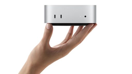
I mean… It looks like the other Mac minis so… Okay.
That doesn’t seem very good for the price.
M4 reportedly outperforms Intel’s Core i9-14900KS by 16%. That CPU alone is over $600.
When… have their products ever been competitive on price? Not even shitting on them, but there’s always been an Apple tax.
Back in 2009-2010 I bought an entry level 13" MacBook Pro because it was fairly competitively priced compared to other options with similar specs, but the MBP had by far the better battery life, display quality, touchpad, and probably keyboard. It was easily worth the upcharge for those factors, so no real Apple Tax.
They’ve often been on par with competitors tbh.
The X1 Carbon isn’t much cheaper than a Macbook Air and ditto for Dell XPS vs Macbook Pro. The Macs have better build quality usually, but the PCs would get better specs. RAM, at least.
The Galaxy S series stars in the same range as iPhones do, though you get a better screen. But in the Ultra and Pro Max versions the screens trade blows and the iPhone is apparently cheaper.
When I was last comparing laptops a few years back I was seriously leaning towards the Framework AMD. It was clearly a tradeoff between Apple’s displays, trackpad, lid hinges, CPU/GPU benchmarks, and battery life, versus much more built in memory and storage, a tall display form factor, and better Linux support. Price was kinda a wash, as I was just comparing what I could get for $1500 at the time. I ended up with an Apple again, in the end. I’m keeping an eye on progress with the Asahi project, though, and might switch OSes soon.
I’m exactly the same, if I was getting a new laptop I’d be completely torn between Framework and Apple, the polar opposites. Part of me wants freedom, upgradability, repairability… And part of me wants a super high quality aluminum body, a trackpad so good you don’t even need a mouse, and whatever magic they do to make their screens look so good even if some PCs have higher resolutions nowadays.
Honestly, now that they put in a reasonable amount of RAM, with a processor that strong and some external storage, 600USD isn’t that terrible of a price.
I’d need to see what comparable x86 processors and graphics are to the M4, but yeah, this seems like it could be one of the first Macs in a while to be really competitive on price. It doesn’t happen often but it does happen. Fifteen years ago, a couple years after Macintosh went to Intel, I bought a Mac Pro. I had a hard time comparing prices at first, but once I finally realized I needed to be looking at workstations instead of desktops the Mac Pro actually came out to be about $300 less than identically spec’d workstations from Dell and HP. That was about the price of a full retail license on Windows Vista Ultimate (or later Windows 7 Ultimate). With Boot Camp and feeling like I could find Windows on sale for less it actually seemed to make the most sense with the added benefit of access to both Windows and OS X. It was frankly the best Windows machine I’ve ever used. No bloat, and all the drivers worked.
I think the issue is - I would buy something positioned as a very long-living and good machine for that price.
Like Sun workstations were. The design and experience of everything.
The issue with Apple is that these things look expensive, temporary and inconvenient (that feeling of concept nice to look at … for a day or so). And what’s worse, they are.
I hope Larry Ellison gets geriatric demented sooner, maybe then he’ll try to resurrect Sun as a separate entity. Just joking, even to Larry Ellison I only wish good health.
I wish him bad health:
https://www.theregister.com/AMP/2024/09/16/oracle_ai_mass_surveillance_cloud/
Oh. F*ck Larry.
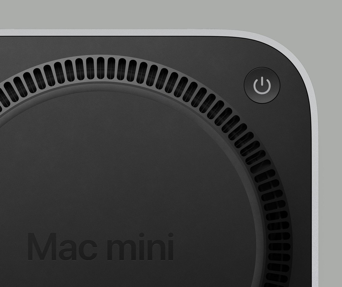
Mac Mini’s are cool, and I appreciate that Apple has some of the most experienced and talented designers in the world… But they put the power switch on the bottom. You have to lift it up and turn it over to turn it on and off.

The previous model has it in the back, you can’t even feel it properly because it’s not recessed.
On the other hand the last time I turned off my M1 mini was when we moved. It’s 100% silent and takes less power than a lightbulb when it sleeps, so why would I bother powering it off.
Why would you run a lightbulb 24/7?
A prior model Mac Mini uses 7W at idle.
So while it sleeps, it still wastes electricity on literally nothing. Gotcha
So does anyone’s desktop PC that they’re too lazy to power off and I can guarantee those will waste even more.
The side with the power button is now the top. There is no ports or io on the bottom.
In case it wasn’t a joke, I imagine it would be high enough for your finger to just poke under it to push the button, like you would a monitor with buttons on the bottom of the screen.
Apple reported to say that you don’t need to use the power button because Mac Mini is not required to shut off.
Remember these are the same engineers who put the Magic Mouse charging port on the bottom, making the mouse unusable while you charge it
People treat it like a mistake but not be able to use the mouse while it’s plugged in is the entire point of the design. Right or wrong the Apple designers thought a cord drag was a bad experience and designed to prevent it.
They probably looked at their target audience and realized there was a certain percentage of folks that would just leave the mouse on the cord 24/7 and wanted to prevent that.
They also know their target audience has plenty of people who gobble up every bad design decision and even defend it online years later.
I don’t understand what was wrong with the original version that just took 2 AA batteries. Reaching for the AA charger and swapping cells not awkward enough or something?
Smart and elegant design would be hiding a battery charger in the iMac it self (maybe even use something smaller than AA), not expect you to flip and plug in your mouse every time ya leave it. The Nintendo Switch, while a completely different form factor, is a great example of an elegant (you could even say “wireless”) charging solution.
I’m getting really sick of the Apple esthetic of sticking out wires, be it the mouse or the dozen dongles for every portable device they now make. Uh! Can’t forget the world’s only pen that needs charging, for seemingly no reason.
They can fit a bigger rechargeable battery in the same space as a battery bay for replaceable batteries. Plus it eliminates the waste of throwing away batteries, and has longer battery life than similarly sized alkalines.
People treat it like a mistake, but the Emperor has no clothes and people are catching on.
Honestly, the mouse charger screams marketing or management. Apple’s brand is partially form over function.
What marketing genius uses a mouse upside down.
It’s better for display
Users aren’t trying before they buy so the display is the most important aspect
Users aren’t trying before they buy so the display is the most important aspect
Trying before you buy is literally the entire point of the apple store
How often have you tried charging while there?
What software do they let you load?
When I check out a device in the store I definitely pick it up, hold it, turn it over, and generally look at every part of it. Things like a charging port on the bottom would probably stick out…
Or like in this case, with the power button on the bottom, I’d definitely notice that as annoying.
What software do they let you load?
Basically anything you want, they don’t tend to watch you at the apple store, unless you seem like you actually want to buy something. They want you to mess around with the machines, so I’ve never seen them password protected in any way, you have admin access.


